This collection is a mix of pictures taken over the past two years and includes pictures from our trip to Indochina at the beginning of 2011 as well as pictures taken on our fall trip through Quebec and the Maritimes.
From the time I started printing in the dark room, I have always used selenium to tone my prints, giving them a very subtle purple colour that enhanced the appearance of the black and white print. Recently I have been experimenting with producing a warm tone and I am getting to like this. In some situations, the cool tone does seem more appropriate. In particular, I find that night photographs and winter scenes do appear more striking printed with a cool tone, but for most other situations, the warm tone is pleasing me more and more.
In this collection, I have included some prints with both a warm tone and a cool tone, and I would very much appreciate feedback as to which rendition you find more pleasing. In addition I am realizing that on occasion, colour can be more appropriate than black and white so I have included a few. You may notice that the colour saturation has been kept low as I feel that this enhances the mood of the picture.
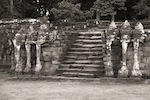 Elephant Terraces, Cambodia |
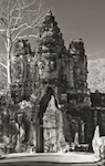 Gate to Angkor Thom, Cambodia |
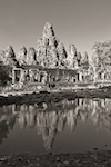 Temple Ruins with Reflections |
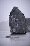 Halong Bay, Vietnam |
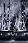
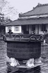 Bronze Pot from Recycled Weapons |
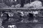 Bridge with Reflections, Vietnam |
 "Reaching Out" |
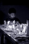 Boy at Prayer |
 Woman at Prayer |
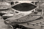 Sampans, Vietnam, warm tone |
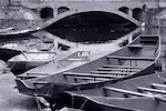 Sampans, Vietnam, cool tone |
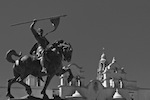 Statue of El Cid |
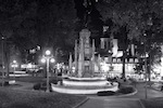 Fountain at Night, Quebec City |
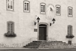 Façade, Laval University, Old Quebec |
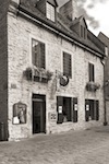 Galerie d'Art, Old Quebec City |
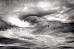 Clouds and Seagull, warm tone |
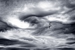 Clouds and Seagull, cool tone |
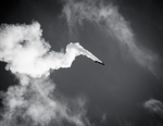 Airshow Spectacle |
All 18 photographs © David Butts
| Top of page | © 2016, Elegant Computing Productions |